Physical Address
304 North Cardinal St.
Dorchester Center, MA 02124
Physical Address
304 North Cardinal St.
Dorchester Center, MA 02124


Walk into a room designed by a top interior designer and you will often notice something surprising: there is very little color. Instead of bold contrasts, the space is built from shades of one or two neutrals, layered through different materials and finishes. This approach is called tonal decorating, and it is one of the defining principles of quiet luxury.
Tonal interiors feel calm, cohesive and expensive without trying too hard. The secret lies in texture. Here is how to create a tonal scheme with dark neutrals and natural surfaces that looks refined in any home.
A tonal interior uses a single color family in several shades, from light to deep. A grey room, for example, might combine charcoal walls, a mid-grey sofa, pale dove cushions and smoky glass accents. Because nothing competes for attention, the eye travels slowly through the space and notices the details: the weave of a fabric, the grain of wood, the soft sheen of a wall.
This is why tonal design is so popular in luxury hotels and high-end residences. It feels deliberate and timeless, and it lets quality materials speak for themselves.
Every tonal scheme needs an anchor, the deepest shade in the room. Dark neutrals such as charcoal, graphite, slate and smoky grey are ideal. They add depth and sophistication, and they make lighter tones around them look richer.
The walls are the natural place for this anchor shade. Premium dark grey wallpaper offers something paint rarely can: subtle surface interest. Look for finishes with a fine woven, plaster or fabric-like texture. In daylight they read as a soft, solid color, but in evening light the texture catches shadows and gives the wall a tailored, almost upholstered quality.
Dark walls work beautifully in libraries, studies, dining rooms and bedrooms, the rooms where we want to feel enveloped rather than energized.
Once the anchor is in place, build the scheme in steps. A simple formula many designers use:
Keep the undertone consistent. Cool greys pair with cool greys, warm greys with warm. Mixing a blue-grey with a greige can make the room feel slightly off, even if you cannot say why.
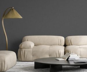
Without texture, a tonal room can look flat. With it, the same palette becomes rich and inviting. The goal is to combine surfaces that feel different to the touch and catch light in different ways.
Natural fibers are the most effective tool here. Linen, in particular, brings an organic irregularity that softens darker shades. A linen texture wallpaper on a second wall, in a lighter tone of the same family, adds warmth and dimension while keeping the scheme cohesive. Its gentle slubs and woven pattern look refined up close and calm from across the room.
Other textures to layer:
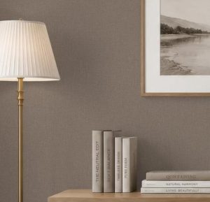
A common worry with dark neutrals is that they will make a room feel heavy. The solution is balance. Pair dark walls with lighter floors, pale rugs or white-oak furniture. Use mirrors and glass to reflect light, and leave some breathing space so the room does not feel crowded.
If you are cautious, start with a single feature wall in a deep shade, and dress the remaining walls in a lighter textured finish. This creates depth without overwhelming the space.
Lighting can transform a tonal interior. Warm bulbs around 2700K bring out the warmth in grey and linen tones, while layered sources such as table lamps, wall sconces and picture lights highlight wall textures. Avoid relying on a single bright ceiling light, which flattens texture and makes dark walls look dull.
Tonal interiors are honest: with no bold patterns to distract the eye, the quality of each material is on display. That is why it pays to invest in the surfaces you see and touch most, such as walls, upholstery and flooring. A well-made textured wallcovering, for example, will look rich for years and hide minor wall imperfections far better than flat paint.
Tonal design is proof that luxury does not have to be loud. By choosing one color family, grounding it with a deep shade and layering natural textures like linen, wool and stone, you can create a home that feels calm, cohesive and quietly elegant. Start with the walls, build your layers slowly and let texture do the talking.